Ten ways brands have used pink in their packaging
Whether you want to make a bold statement or show off a soft, feminine design, the color pink is extremely versatile when it comes to packaging. We've rounded up ten businesses who used pink in a variety of ways to get your inspiration flowing.
By Elly Strang — 28 July, 2020
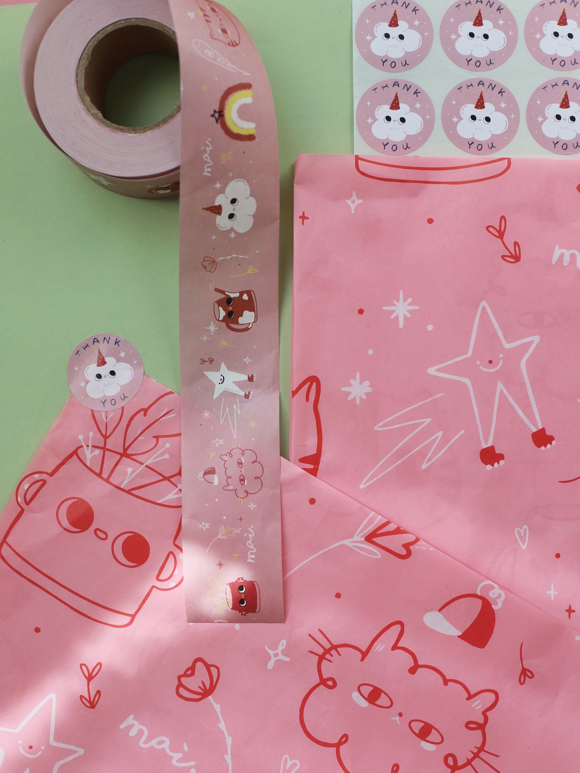
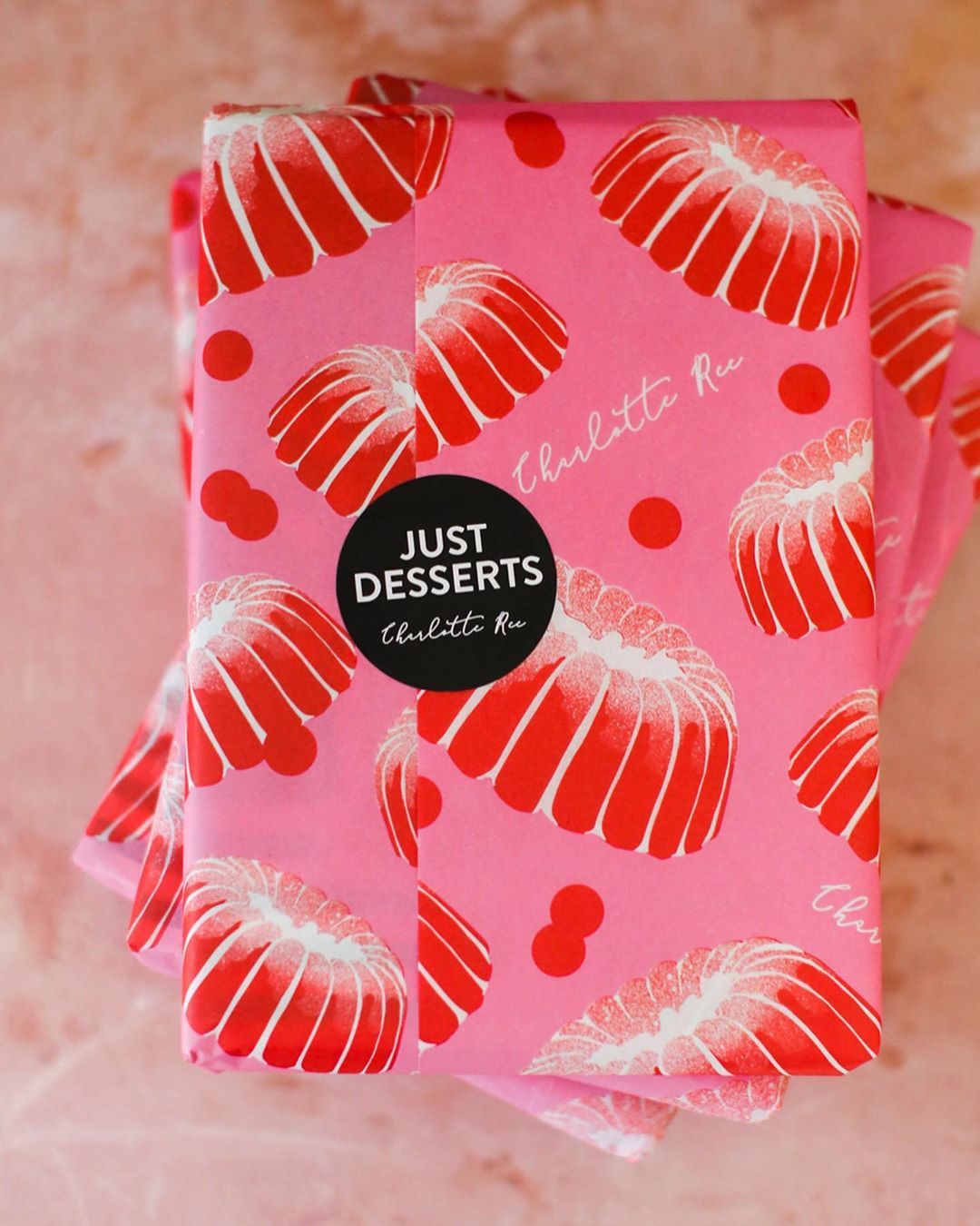
Photo by @mai_accents
When it comes to your packaging, what’s in a color? Quite a lot, it turns out.
The shade you pick for your packaging is far from being a minor feature, as research shows colors can completely alter a customer’s perception of your brand.
In a study called the Impact of color on marketing, researchers found that up to 90% of snap judgments made about products can be based on color alone.
While certain shades are associated with broad characteristics, researchers say that it’s more important for colors to speak to your brand’s unique personality rather than align with stereotypical meanings.
This is because the way we perceive a color is often shaped by our own individual experiences, memories, cultures and preferences. Because different shades hold different meanings to people, universally accepted meanings don’t hold as much weight as we think they do.
This is good news for businesses, because it means you can be more adventurous with the color of your packaging! Our advice? Be bold, think outside the box and focus on choosing the color (or colors) which best reflect your brand’s personality.
A quick FYI: When it comes to noissue, you can pick a color for your packaging that’s completely unique to you by selecting a custom color from the Pantone library. You can learn more about the Pantone color identification system and how it ensures your packaging will print to exactly your desired shade here. We also use soy-based ink, which prints brighter, more vibrant colors – win, win!
To get the inspiration flowing, here are 10 businesses who have used pink in their packaging to make their colors pop.
Doodle Moo
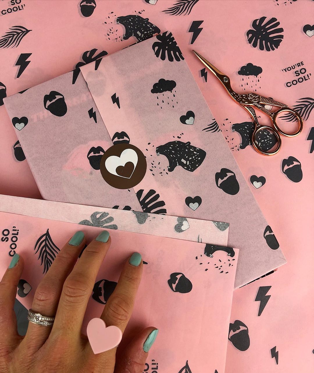
Doodle Moo’s motto is that a creative and colorful life is a happy life. We’d have to agree with that! Its online store sells art, stationery, jewellery and homewares that feature bold designs and typography. Doodle Moo’s design style in their products is always consistent: playful, adventurous and colorful, with shades of pink often used. It’s no surprise, then, that they chose their noissue tissue paper to be a soft pink that contrasts with black pop art designs, such as hearts, lightning bolts and feathers. This color choice lets their brand’s creative personality shine through.
Mai Accents

Mai Accents is a ceramics studio that creates whimsical pottery, from pot plants, to plates and mugs that each have their own unique personality (and faces!) These adorable creatures that originate from founder Marzia Kjellberg’s mind have also made their way onto Mai Accent’s pretty pink tissue paper packaging and custom tape. Illustrated characters in shades of red, pink and white show off the company’s imaginative and dreamy design style, while also keeping their branding consistent and in line with their products.
Niaski
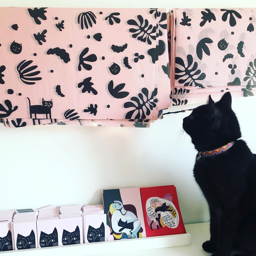
Niaski is a design studio that’s no stranger to using packaging to tell its unique brand story. Founder Nia Gould’s creative approach is inspired by the love of her pet cats and they have since made their way into featuring in much of her work, including her custom noissue tissue paper. With the design studio’s brand identity being centred around the life and times of artistic felines, it makes sense that her tissue paper is a contrasting pink and black design that features her beloved furry friend Frida as a muse (pictured). We love this playful and modern look, and we’re sure her customers identify who the package is from straight away!
Club Crafted
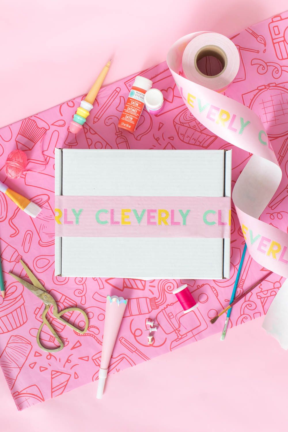
Club Crafted is a playful lifestyle brand that began as a blog and has now has launched an ecommerce store that sells quirky t-shirts, acrylic jewellery and accessories. For their noissue tissue paper, they chose to showcase their brand’s fun-loving personality through a two-tone pink print that features craft items like sewing machines, paint brushes, cameras and more. Its noissue custom tape featuring a rainbow of colors that perfectly complements its tissue paper. This color combination will no doubt brighten customers’ days!
Leah Duncan
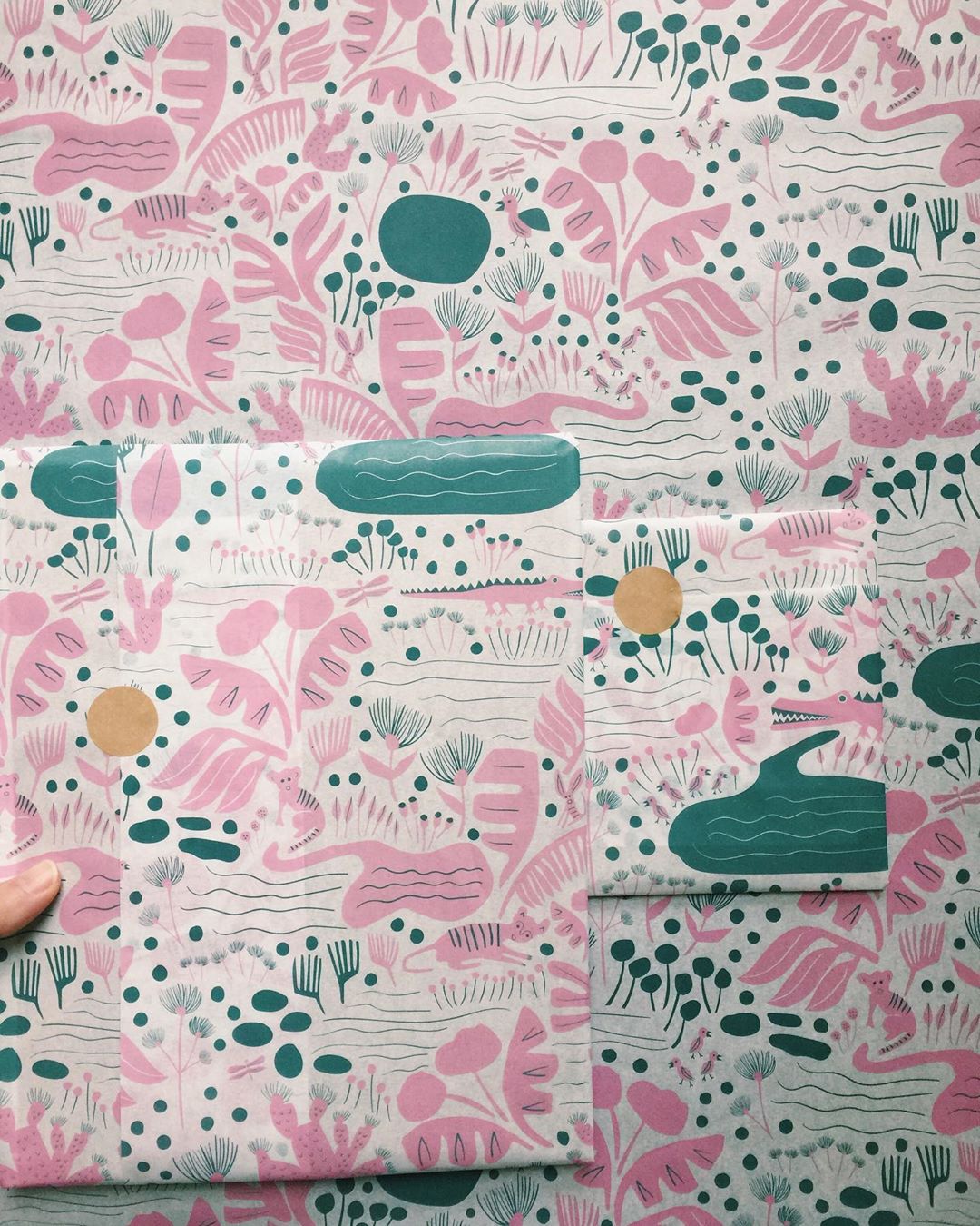
Leah Duncan is a United States-based artist that creates illustration, design, textiles and surface patterns featuring beautiful and detailed designs inspired by nature. Each of her pieces use soft color palettes and quirky and organic designs to reflect her love of the outdoors. For her noissue tissue paper, Leah chose to showcase a nature scene with foliage and animals in shades of pink and green. This makes for a calming yet eye-catching color combination that stands out from the crowd.
Ashley Mary Art
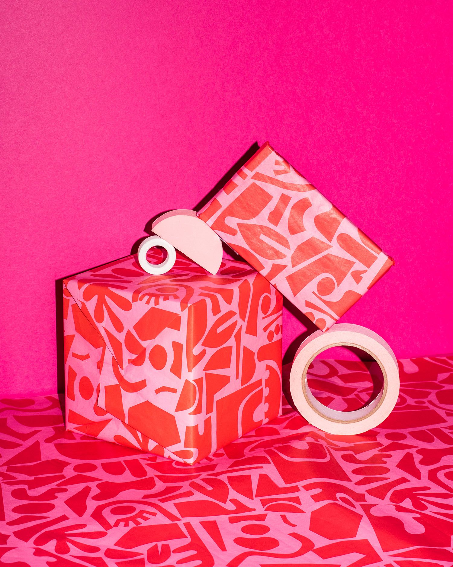
Pink doesn’t always have to be a soft, feminine shade. It can be strong, too – just take a look at Ashley Mary's packaging. She’s an artist who creates eclectic custom artwork, socks, earrings and more using graphic patterns and shapes in a vivid range of colors. For her noissue tissue paper, Ashley used one of her bold artworks in a loud shade of red and pink. The result is a fun and fierce look that shows off her unique design style.
Dancing with Juniper
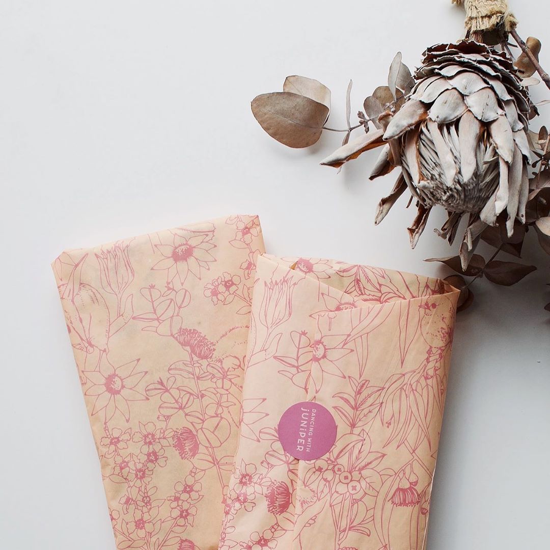
Dancing with Juniper is an Australia-based brand that creates fun, floral textiles for the home, from tea towels, to tote bags, to cushions. They’ve chosen to reflect their brand’s identity by showcasing a detailed floral design on their noissue tissue paper. We love their color combination of peach and pink to create a feminine yet unique take on floral packaging.
Laura Lhuillier
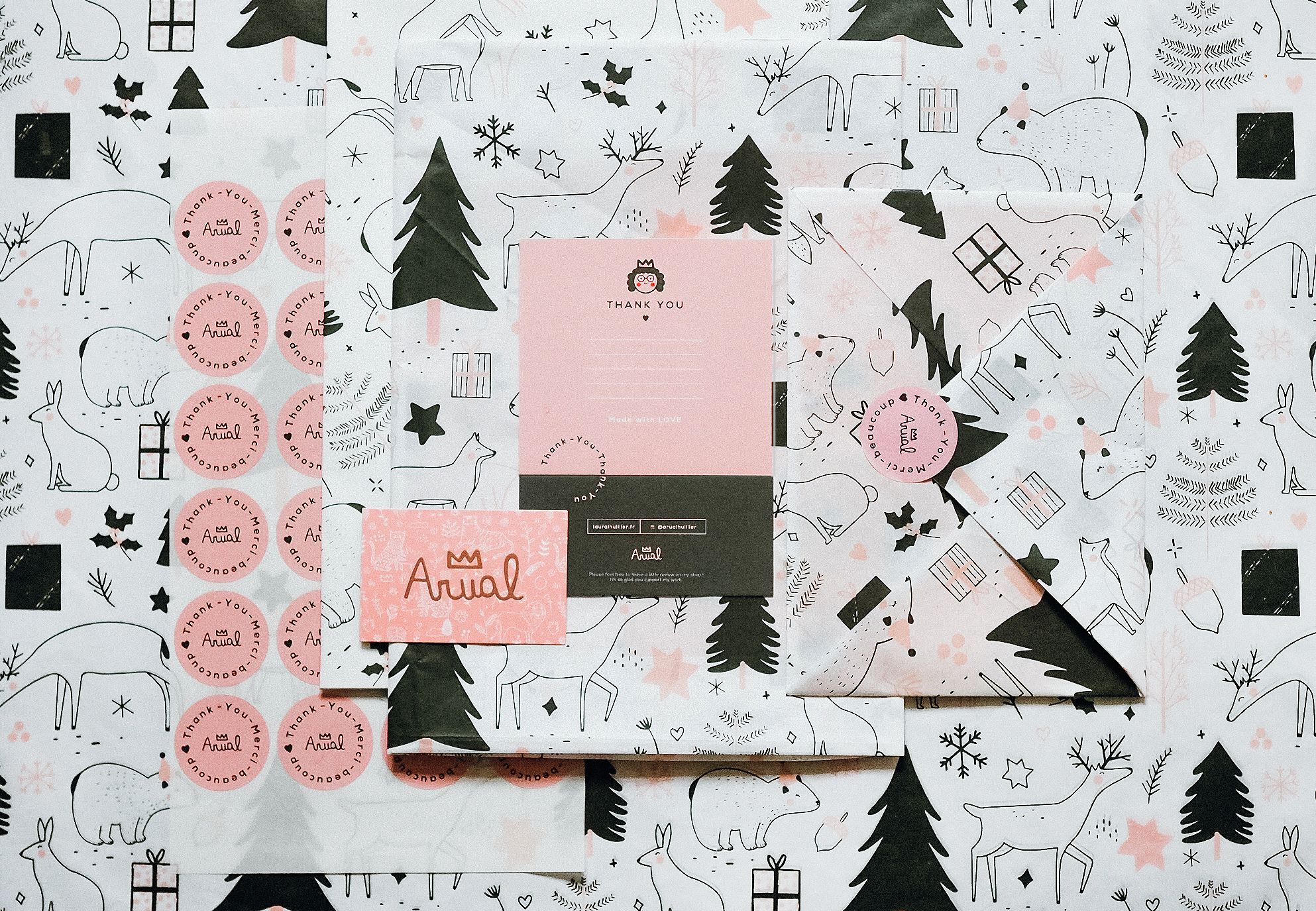
It’s nearly August (where did the year go?) which means it’s time to start thinking about what your packaging is going to look like these holidays. While red and green are undoubtedly the colors most commonly associated with Christmas, it’s important to make sure your brand’s personality is featured in your festive packaging, too. France-based illustrator and designer Laura Lhuillier does this beautifully with her packaging by combining pink and dark green colored tissue paper with pink custom stickers and a pink custom thank you card. Her gorgeous illustrations of reindeer, Christmas trees and other festive motifs tie the design back to the holidays, and the color scheme makes it a refreshing take on a popular category.
Clare Nicolson
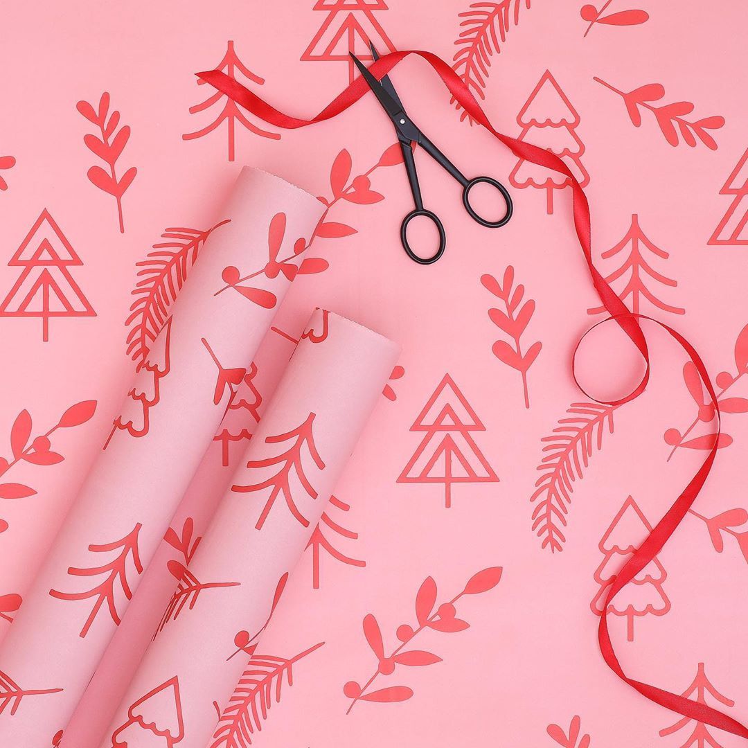
Clare Nicolson is another contender for this year's holiday packaging inspiration. She's a graphic design artist who designs prints, wall hangings and cushions, and her signature design style uses geometric shapes in a rainbow of colors. We’re big fans of the vibrant custom noissue tissue paper she created for Christmas. Putting aside the usual festive colors, Clare has instead opted for a bold design that uses two shades of pink and visuals of geometric Christmas trees and plants. Clare's approach shows you don’t have to play by the rules when it comes to holiday packaging – you should just do what best reflects your brand's personality.
Dainty Forest
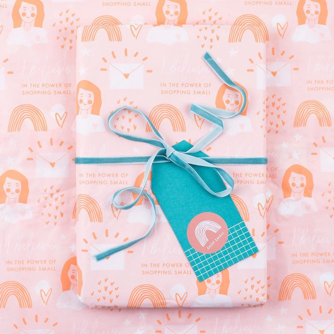
Dainty Forest is an illustration and design studio that creates cheery prints and cards that aim to bring a dash of joy and splash of color to people's homes. Its works typically feature pastel colors and typography, which is why it has continued this brand identity right through to its packaging. Its noissue tissue paper is white, orange and pink in color and combines hand-drawn illustrations with typography that says 'I believe in the power of shopping small'. We love how they've emphasized shopping local by including this thoughtful mantra on their packaging, and the warm color palette only adds to these positive feelings.
Honourable mentions
We hope you enjoyed this look at the different ways the color pink can be used in packaging. Whether it’s a soft and feminine look or a bold, modern design you’re after, our customers show this color is extremely versatile and can be used in a variety of ways.
Remember that when it comes to color, the beauty (and the meaning) is always in the eye of the beholder, so focus on showing off your brand’s unique personality first and foremost.
Happy designing!
Have you used pink in your packaging? Tag us on the 'gram – @noissueco